


When it comes to building an online store, many people confuse two key concepts — UI and UX. At first glance, they look like the same thing, but there’s a real difference between them, and it’s usually the reason a site sells or just sits there.
Let’s start with a simple explanation.
UX (User Experience) is the overall experience a user has while interacting with your website. It’s about how easy it is to find a product, how clear the checkout process is, and whether the user faces any friction along the way.
UI (User Interface), on the other hand, is the visual part of your website. It includes buttons, colors, typography, icons, and the overall look and feel.
UI is part of UX, not the other way around.
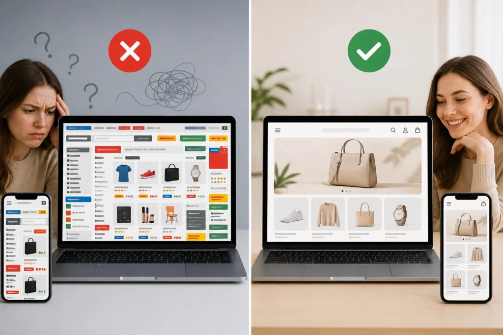
A website can look gorgeous and still be a pain to use — that’s one of the most common mistakes we see in eCommerce.
Imagine this: you land on a stylish website with modern animations and great visuals, but you can’t find the “Buy” button or the checkout process takes too long. Most likely, you’ll leave and go to a competitor.
Here’s where UX earns its keep.
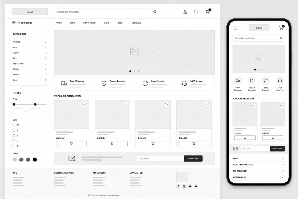
What’s included in eCommerce UX:
- Logical catalog structure
- Intuitive navigation
- Fast product search
- Simple checkout process
- Mobile responsiveness
What’s included in UI:
- Button design
- Color palette
- Typography
- Icons
- Visual hierarchy
How this shows up in sales
Ignoring UX directly impacts your revenue. If users feel uncomfortable navigating your site, they won’t buy. It’s that simple.
Common UX issues:
- High bounce rate
- Abandoned carts
- Low conversion rate
- Poor user experience
The good news is that even small improvements can make a noticeable difference.
For example:
- Simplifying the checkout form
- Clear call-to-action buttons
- Fast page loading speed
- Well-structured categories
Balancing UI and UX is the key to success
The ideal online store combines aesthetics with usability.
Users should not only enjoy the design but also achieve their goal — making a purchase — effortlessly.
In simple terms:
UX answers the question “How easy is it to use?”,
while UI answers “How does it look?”
Only together do they create an experience that keeps users coming back.
Conclusion
If you’re planning to launch or redesign a store, start with how easy it is to actually buy something, not with the color palette.
A good-looking interface without solid UX won’t sell much, and solid UX without a decent UI won’t catch anyone’s eye in the first place. Put them together, and you get a store people want to come back to.